I spent three summers chasing the brightest neon pieces I could find. Highlighter yellow bodysuit. Electric orange shorts. A lime green bucket hat that glowed under blacklight. And you know what? In every single photo, I looked like a blurry, washed-out mess. The problem wasn’t the brightness. It was the lack of contrast.
After 15 festivals across six countries, I’ve learned one hard rule: bright festival outfits only work when you balance saturation with shadow. Pure neon on neon turns you into a single flat blob of color. The real trick is pairing a single high-impact piece with deep, muted, or black anchors. Here’s exactly how I do it now.
The Color Contrast Table That Changed My Packing
Before I buy anything for a festival, I run it through this mental grid. It saves me from buying another $60 neon crop top that I’ll wear once.
| Bright Piece | Best Anchor Color | Worst Pairing | Why |
|---|---|---|---|
| Hot pink | Black or charcoal | Lavender | Pink on pink = no separation. Black makes the pink scream. |
| Electric blue | White or cream | Teal | Blue on blue = lost edges. White frames it cleanly. |
| Lime green | Deep olive or black | Yellow | Green + yellow = muddy. Olive adds depth without competing. |
| Neon orange | Navy or dark brown | Coral | Orange on orange = fire hazard. Navy cools it down. |
| Bright yellow | Black or dark denim | Beige | Yellow + beige = dirty dishwater. Black gives it teeth. |
I printed this table and taped it inside my closet. It’s stopped me from buying at least four regrettable outfits this year alone.
Why I Stopped Buying Neon Bodysuits (And What I Wear Instead)
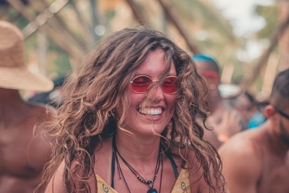
Neon bodysuits are the default festival purchase. Every influencer wears them. Every shop sells them. And they’re almost always a mistake for real life. Here’s why: neon fabric shows every sweat stain, every wrinkle, every crease from sitting on the ground. By hour three of a festival, you look like you slept in a dumpster.
I switched to structured pieces with intentional brightness. My current go-to is a high-waisted pleated skirt in electric blue from ASOS Design ($45). The pleats create visual texture that breaks up the flat color. I pair it with a plain black cropped tank from Uniqlo ($20) and black platform sandals. The blue pops because the black gives it room to breathe.
Another move: bright accessories instead of bright clothing. A neon yellow fanny pack from Herschel ($35) or a hot pink bucket hat from Brixton ($30) gives you the color hit without committing your whole body to it. You can wear neutral basics and still look festival-ready.
The Fabric Trap: Why Cheap Brights Look Worse Than Muted Colors
Here’s something nobody tells you: bright dyes amplify fabric flaws. A cheap $15 neon dress from a fast-fashion site will look see-through, uneven, and cheap under direct sunlight. I learned this the hard way when my “electric coral” dress turned out to be a translucent mesh that showed my underwear in every photo.
Stick to these fabrics for bright pieces:
- Cotton jersey with at least 200 GSM weight — thick enough to hold the dye evenly. Look for the weight on the tag.
- Polyester-spandex blends with a matte finish — shiny polyester brights look like Halloween costumes. Matte finishes read as intentional.
- Linen-cotton blends in bright colors — rare but worth hunting. Linen’s natural texture softens the brightness into something wearable.
Avoid anything labeled “sheer” or “lightweight” in a bright color. Those words mean “see-through” in fashion-speak. I’ve returned three items this year alone that looked solid online and arrived transparent.
Three Brands I Actually Trust for Bright Festival Pieces (And One I Don’t)
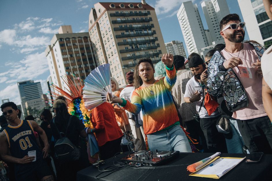
After burning through dozens of brands, here’s my shortlist:
Loud Bodies ($60-$90 per piece) — This small brand makes bright-colored linen and cotton pieces in extended sizes. I own their hot pink wide-leg jumpsuit ($78). The fabric is thick, the color is saturated, and it’s held up through three festivals and two dozen washes. They restock colors seasonally, so sign up for alerts.
Big Bud Press ($50-$80 per piece) — Their bright-colored work pants and jumpsuits are legendary in the festival community. I have the electric blue work pants ($72). They’re heavyweight cotton twill with deep pockets. The color hasn’t faded after 15 washes. Sizing runs generous — I sized down one.
Lucy & Yak ($40-$60 per piece) — Their bright-colored dungarees and wide-leg pants are comfortable for all-day wear. The corduroy options in bright colors ($55) are surprisingly durable. I wore the lime green corduroy pants for a three-day festival and they didn’t pill or fade.
Brand I avoid: PrettyLittleThing — Their bright festival pieces look great in photos but arrive with uneven dye, thin fabric, and weird shrinkage. I bought a neon yellow co-ord set ($35) that turned green after one wash. Not worth the savings.
The One-Layer Rule That Saves Every Bright Outfit
Here’s the simplest rule I use: one bright layer, one neutral layer, one texture layer. That’s it.
Example: Bright orange cropped hoodie (bright layer) + black bike shorts (neutral layer) + a silver chain belt or mesh overlay (texture layer). The texture breaks up the color blocks and gives the eye something to rest on.
Another example: Electric blue mini dress (bright) + white sneakers (neutral) + a crocheted shoulder bag (texture). The white shoes ground the blue. The crochet adds visual interest without competing.
When I skip the texture layer, the outfit looks like a costume. When I add it, people ask where I bought the whole look.
When Bright Festival Outfits Fail Completely (And What to Do Instead)
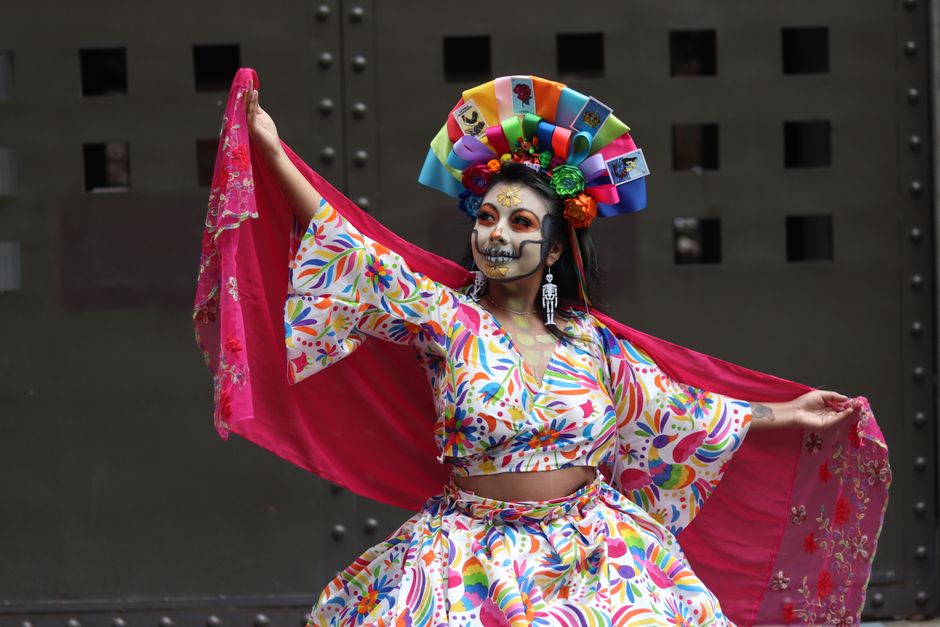
Bright outfits fail in three predictable ways. Here’s how to avoid each one.
Failure 1: The outfit is too matchy-matchy. Matching bright top + bright bottom + bright accessories = a walking highlighter. Your eye can’t find a focal point. Fix: pick one bright piece and make everything else neutral or dark. The bright piece becomes the star.
Failure 2: The colors fight the setting. Bright orange at a dusty desert festival? You’ll look like a construction cone. Bright white at a muddy field festival? You’ll look dirty by noon. Fix: match your bright to the environment’s opposite. Green fields = hot pink or orange. Desert = electric blue or purple. Muddy grounds = bright yellow or lime green. The contrast with the background makes you pop in photos.
Failure 3: The brightness is the only thing going on. No texture, no silhouette, no fit — just color. That’s a costume, not an outfit. Fix: spend your money on fit first, color second. A well-fitted bright jumpsuit will always beat a baggy neon dress, even if the color is less intense.
I’ve made all three mistakes. I have the photos to prove it. Don’t be me.
Bright Doesn’t Mean Neon
The biggest shift in my festival style was realizing that bright doesn’t have to mean neon. Saturated jewel tones — emerald, sapphire, ruby, amethyst — read as “bright” in photos and in person, but they don’t wash you out the way neon does. They also photograph better under artificial festival lights.
I now pack one neon piece for the novelty and three jewel-tone pieces for the actual photos. My emerald green linen jumpsuit from Loud Bodies gets more compliments than any neon item I’ve ever owned. It’s bright enough to stand out in a crowd but rich enough to look intentional.
Next time you’re shopping for festival season, ask yourself: would I wear this color to a dinner party? If the answer is no, it’s probably too extreme for a full outfit. Use it as an accent instead. Your festival photos will thank you.